Introduction to the Logo Change
Cracker Barrel, a cherished American restaurant chain and retail store, has recently unveiled a new logo, marking a significant transition after nearly five decades of brand identity. This update is emblematic of the company’s desire to maintain its traditional roots while simultaneously embracing modernity. Established in 1969, Cracker Barrel’s first logo featured a simple text-only design that conveyed a sense of home and comfort—a theme that remains central to its identity. However, in 1977, the brand introduced a new logo featuring an iconic figure of a man resting on a barrel, which not only became a hallmark of the brand but also encapsulated the leisurely, welcoming atmosphere that patrons associate with Cracker Barrel.
The decision to revert to a text-only logo in the latest redesign represents a purposeful return to basics, aiming to resonate with both longtime fans and new customers navigating evolving market trends. This logo change reflects a broader movement within the corporate world, where businesses strive to simplify and enhance brand recognition in an increasingly digital landscape. The minimalistic approach of the new logo serves to embody a sense of clarity and purpose, aligning with contemporary aesthetics while still honoring the nostalgic elements that have made Cracker Barrel a staple in American dining culture.
As Cracker Barrel moves forward, the brand’s commitment to offering quality food and a warm atmosphere remains unchanged. The logo transition assists in solidifying this commitment by framing it within a modern context, appealing to a wider audience without losing touch with the values that define the Cracker Barrel experience. This blending of old and new is not merely a cosmetic change; it is a strategic alignment that reflects the company’s enthusiasm for future growth while staying true to its foundational essence.
Design Elements and Aesthetic Choices
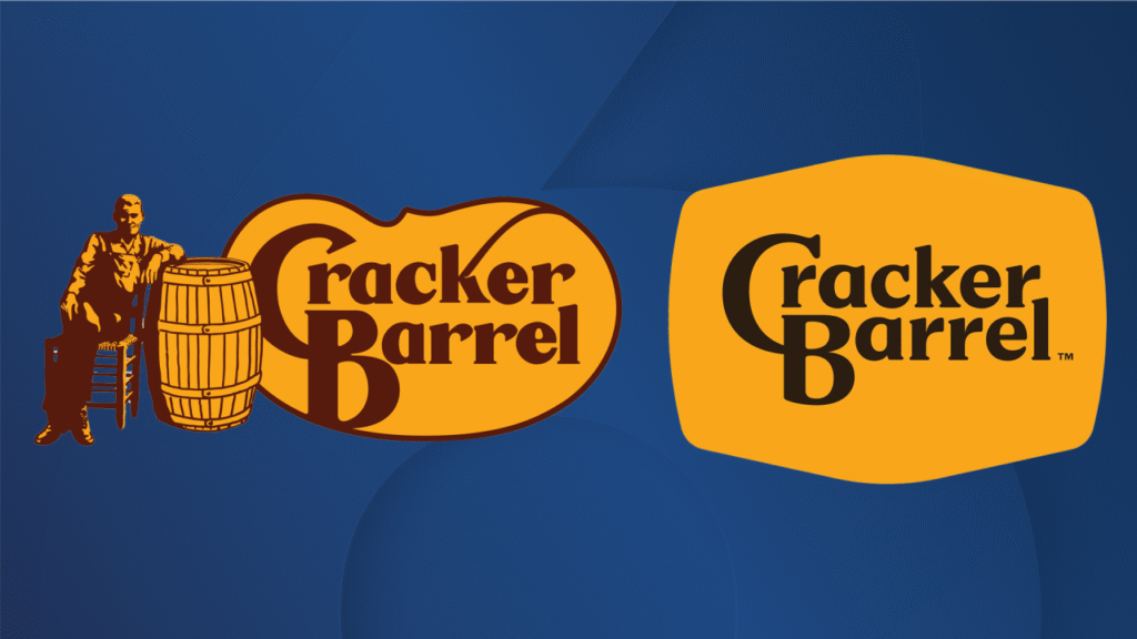
Cracker Barrel’s rejuvenated logo encapsulates the brand’s timeless essence while embracing a modern aesthetic. Central to this transformation is the thoughtful integration of the established color palette, prominently featuring the signature gold and brown hues. This strategic choice not only maintains continuity with the original branding but also resonates with customers who have come to associate these colors with the warmth and nostalgia of Cracker Barrel’s dining experience. The familiar tones evoke a sense of comfort, which aligns perfectly with the brand’s commitment to providing a welcoming environment for families and friends.
A core component of the new design is the revised wordmark, which elegantly reflects the company’s identity. The typeface has been carefully selected to convey a balance between modernity and tradition, ensuring that it remains accessible while still honoring the heritage of the brand. The harmonious blend of contemporary fonts with classic design elements serves to bridge the gap between past and present, appealing to both long-time patrons and new customers exploring the restaurant’s offerings. The decision to ensure that the wordmark is closely tied to the iconic barrel shape further reinforces Cracker Barrel’s roots, reminding diners of the rich history that is an integral part of the brand story.
Transitioning to various brand materials, such as menus and marketing collateral, this new design will be implemented with deliberate precision. Ensuring cohesion across all platforms is vital for maintaining brand recognition. By incorporating the updated logo consistently, Cracker Barrel aims to enhance its visibility while inviting patrons to enjoy the rustic yet refined experience that dining at their establishments promises. The logo not only marks a logo evolution; it symbolizes a commitment to honoring the legacy of quality food and service while stepping into a vibrant future.
Community Engagement and Celebrating Change
As Cracker Barrel unveils its new logo, the emphasis on community engagement reflects the brand’s deep-rooted commitment to its customers. To commemorate this exciting launch, Cracker Barrel is offering complimentary classic sides on the launch days, inviting patrons to participate in the celebration. This initiative is a testament to the company’s dedication to creating memorable dining experiences and fostering connections with their customer base. By providing these complimentary offerings, Cracker Barrel not only brightens the day of their guests but also encourages a sense of belonging within the community.
Chief Marketing Officer Sarah Moore emphasizes that the brand’s philosophy is centered around genuine hospitality. She acknowledges that while the new branding signifies a shift towards modernity, it simultaneously honors the traditions that have defined Cracker Barrel for decades. This balancing act is pivotal as the company seeks to evolve with the changing preferences of its customers while retaining the warm, inviting atmosphere that has made it a beloved dining destination. Sarah’s insights highlight that the new logo is much more than just a visual update; it represents an ongoing dialogue with the community it serves.
Cracker Barrel’s aim to uphold its legacy is evident in the way it engages with its patrons, reminding them of the importance of the communal dining experience. The blend of modern visual identity and traditional values aims to resonate with both longstanding customers and new visitors alike. By celebrating this change, Cracker Barrel reinforces the idea that it remains dedicated to the same principles that have endeared it to many: a warm welcome, hearty food, and an inclusive environment. Thus, as the company steps into modernity, it continues to cherish the spirit of togetherness that lies at the heart of its brand ethos.
Cultural Impact and Personal Insights
Cracker Barrel has long been emblematic of American dining, often regarded as a nostalgic beacon that embodies both culinary tradition and a warm, inviting atmosphere. Since its inception, the brand has garnered a significant cultural footprint, particularly in the South, where the combination of comfort food and rustic decor creates an ambiance reminiscent of home. For many patrons, a visit to Cracker Barrel transcends mere dining; it is an experience interwoven with fond memories and shared moments with family and friends.
Artists and musicians, such as Davis, often draw parallels between their creative work and the unique Cracker Barrel experience. For them, the restaurant serves as a meeting point for cultural exchange—an environment that not only nourishes the body but also stimulates the spirit. Davis articulates how the warmth and authenticity found in Cracker Barrel’s locations can inspire creativity, suggesting that the communal essence of shared meals fosters a sense of belonging and artistic expression. Music often heralds the individual stories of people, and Cracker Barrel acts as a backdrop to those unfolding narratives, allowing patrons to forge connections in a culturally rich setting.
The brand’s recent logo redesign is not merely an aesthetic choice; it signifies a broader commitment to maintaining its legacy while embracing contemporary relevancy. This balance between modernity and tradition resonates deeply with loyal customers, ensuring that Cracker Barrel continues to hold a cherished place in the hearts of many. By evolving its visual identity, Cracker Barrel acknowledges the changing tides of society while reinforcing its mission to unite individuals through the universal language of food and togetherness. Emphasizing this connection casts the restaurant as a symbol of cultural continuity, enabling it to remain relevant in the fabric of American dining.